TANGERINE HOME
BUSINESS
Home Styling & Decor Retailer
SCOPE OF WORK
-
Brand identity development
-
Art direction
-
Website design
-
Copywriting
-
Photography direction
Tangerine Home came to me inspired by British punk rock, yet visually aligned with the soft, feminine Shabby Chic trend of the 80’s and 90’s. The tension was obvious. How could wrought iron bed frames and antique candlesticks feel rebellious?
That's where the work began.
Voice
Chic
Approachable
Spirited
AaBbCc
1234 #$!
AaBbCc
1234 #$!
Typography
Color


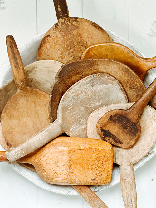
Photography
LOGO + TAGLINE
Tangerine Home’s competitors skew heavily feminine. Rather than lean into romantic scripts and pastel palettes, I went the opposite direction—choosing an edgy, rustic script in chocolate brown. The tangerine mark became a bold orange scribble instead of a polished illustration.
My early tagline explorations—“curious decor” and “funky furnishings”—felt forced. “Perfectly imperfect decor” didn’t. And so it was.
THE WEBSITE
Tangerine Home initially provided low-resolution, inconsistently styled imagery. I advised waiting for the right photographer and stylist—even if it meant delaying launch. The result was a cohesive visual narrative that elevated both the product and the brand.


BEFORE
AFTER


WEBSITE RESULTS
3m 27s average session duration
3.1 average pages per session


BRANDING MATERIAL
The first printed piece I designed was a packaging insert. I paired the boots-and-disco-ball image with copy that leaned into the brand’s irreverence. My client gave me the following response: 😂 😂 😂 , which I took as her utmost approval.

